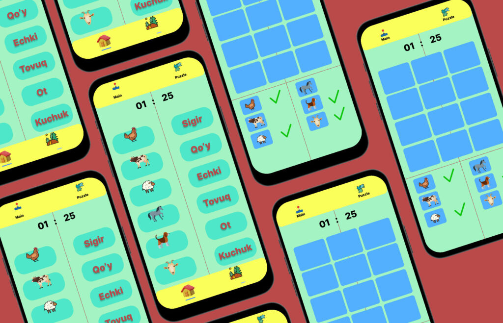
Introduction to Typography in App Design
Typography is a crucial element in app design that significantly influences user experience and engagement. It involves the style, arrangement, and appearance of text, which collectively contribute to how users perceive and interact with an app. In today’s competitive digital landscape, where first impressions matter greatly, effective typography can make a substantial difference in how an application is received by its audience.
One of the basic concepts of typography includes understanding font types, sizes, and weights. Fonts can broadly be classified into categories such as serif, sans-serif, monospaced, and display fonts. Each category evokes different feelings and associations, which can affect the app’s overall tone and usability. For instance, serif fonts often convey a sense of professionalism and tradition, making them suitable for business or educational apps. In contrast, sans-serif fonts tend to appear modern and clean, often preferred for casual or contemporary applications. Moreover, the appropriate selection of font size and weight ensures readability across various devices, which is critical for maintaining user engagement.
Furthermore, the hierarchy of typography—reflected in size variations and styles between headings, subheadings, and body text—guides the user’s attention and navigation within the app. By thoughtfully arranging these elements, designers can lead users through a seamless experience, encouraging them to take desired actions. Proper spacing and line height also play a vital role in preventing visual clutter, thereby enhancing the overall aesthetic appeal of the app.
In sum, typography in app design is not merely about selecting a font but involves a comprehensive understanding of how text choices influence user perception, guide interactions, and ultimately shape engagement. This foundation sets the stage for exploring the deeper implications of typography choices on app effectiveness.
Understanding Typography Basics
Typography encompasses the art and technique of arranging type to make written language legible, readable, and visually appealing. At its core, typography includes several foundational elements: font families, styles, sizes, and weights. Each of these components plays a significant role in shaping the overall user experience within mobile and web applications.
Font families serve as the primary classification groups for typefaces, which can significantly influence the perception of an application. Common categories include serif, sans-serif, script, and decorative fonts. Serif fonts, with their small lines or decorative strokes at the ends of characters, are often perceived as traditional and formal. In contrast, sans-serif fonts are regarded as more modern and clean, making them widely used in digital environments. Choosing the appropriate font family can affect users’ emotional connection to the app, thereby impacting their engagement levels.
Within each font family, styles such as italic, bold, and underline allow for variation in emphasis and clarity. Utilizing these styles effectively can help in creating a visual hierarchy, guiding users’ eyes to the most important information first. In addition, font size is another critical aspect of typography that directly impacts legibility. Mobile applications, in particular, must consider how users interact with their devices, making it essential to use sizes that are easy to read on smaller screens.
Weight refers to the thickness of the characters, providing an additional layer of emphasis and clarity. Heavier weights can draw attention to specific elements, while lighter weights might be suitable for more body text. The harmonious combination of these typography elements ensures that text not only looks aesthetically pleasing but also remains easy to read. Prioritizing legibility is vital in the context of app design, as any hindrance can significantly detract from user engagement and satisfaction.
The Psychology of Typography
Typography plays a pivotal role in shaping users’ perceptions and emotions while interacting with an application. The choice of font can greatly influence the user’s experience, often subconsciously steering them towards certain feelings or attitudes. Research in cognitive psychology suggests that different typefaces can evoke specific responses, which is crucial for app developers and designers aiming to enhance user engagement.
For instance, serif fonts, characterized by their traditional and formal appearance, often instill a sense of trustworthiness and reliability. They are frequently used in financial and legal applications where credibility and professionalism are paramount. Conversely, sans-serif fonts tend to convey a more modern and approachable demeanor. Their clean lines and simplicity can enhance readability on digital screens, making them popular choices for tech-oriented apps and websites.
The impact of typography extends beyond just aesthetics. Consider how a playful font can evoke feelings of creativity and innovation, making it suitable for a design or arts app. In contrast, a more minimalistic font may signal a sleek, cutting-edge experience, appealing to users looking for efficiency. Additionally, the weight and style of the typeface can further influence emotional responses; heavy, bold fonts may communicate strength and confidence, while lighter fonts could evoke a sense of calmness and ease.
Furthermore, consistent typography contributes to a cohesive brand identity, which can significantly influence user loyalty. By aligning typographic choices with the intended emotional response, developers can cultivate a deeper connection between the app and its users. Understanding these psychological underpinnings is essential for leveraging typography to boost app engagement, ensuring that the text serves not just as a means of communication but also as a powerful tool for emotional resonance.
The Relationship Between Typography and Brand Identity
Typography plays a crucial role in shaping a brand’s identity, serving as a visual representation of its values and ethos. The fonts, styles, and sizes chosen by a brand contribute significantly to how it is perceived by its audience. Consistent typography across various platforms creates a cohesive brand image, allowing consumers to recognize and associate the typeface with the brand. For instance, a luxury brand may opt for elegant serif fonts that convey sophistication, while a tech startup might choose modern sans-serif typefaces that communicate innovation and simplicity. This strategic approach to typography can reinforce a brand’s message and cultivate a strong emotional connection with users.
Moreover, the alignment between typography and overall brand messaging is essential for engaging users effectively. Brands that fail to maintain consistency in typo-graphical elements risk creating confusion about their identity. For example, a playful brand using an overly formal typeface may send mixed signals, leading to user disengagement. A mismatch between typography and brand identity can also diminish trust, as customers may perceive the brand as unprofessional or disjointed. Therefore, careful consideration of typeface selection can enhance or undermine the intended brand experience, influencing user engagement and retention.
In light of these considerations, it becomes evident that typography is not merely an aesthetic choice but a strategic tool that shapes brand identity. Each typographic decision reflects deeper values and communicates the essence of the brand to its audience. As brands navigate the complexities of user engagement, the thoughtful selection of typography emerges as a fundamental aspect of successful branding efforts. Consistency in typography, aligned with the brand’s core messages, fosters a strong identity that resonates with users, ultimately enhancing their overall experience.
Readability and User Experience
Readability plays a crucial role in the overall user experience of an application. Typography choices directly influence how easily users can engage with content, thereby affecting their satisfaction and likelihood of continued use. A well-considered font selection can significantly enhance readability, making it more accessible for users across various demographics.
Several factors contribute to achieving optimal readability in app typography. First and foremost is font size. A larger font size improves legibility, especially for users with visual impairments or those using smaller devices. A general recommendation is to use at least 16 pixels for body text. Lesser sizes may force users to strain their eyes, which can lead to frustration and potential disengagement.
Another vital element is line spacing, or leading. Adequate spacing between lines of text can enhance the reading experience by allowing users to differentiate between lines easily. Too little spacing can lead to a crowded appearance, making it difficult for users to follow along. A standard practice is using a line height of 1.5 times the font size, as this creates a more inviting and easy-to-read flow.
Furthermore, contrast is a critical component that cannot be overlooked. High contrast between text and background colors ensures that the content stands out, which is particularly beneficial for users with low vision or color blindness. Employing dark text on a light background or vice versa can improve readability tremendously. It’s also advisable to avoid overly vibrant colors that might distract users or cause discomfort when reading longer texts.
Incorporating these best practices into typography choices not only enhances readability but also fosters a more engaging user experience. When users can easily digest information, their satisfaction and likelihood of returning to the app are significantly increased.
Typography Trends in Mobile Applications
Mobile applications have evolved significantly over the years, and typography plays a crucial role in shaping user experience and engagement. Recent trends in typography within mobile applications encompass innovative techniques that not only enhance aesthetic appeal but also foster user interaction. One prominent trend is the use of variable fonts. These allow developers to incorporate a wide range of weights and styles within a single font file, offering flexibility and enabling a rich visual hierarchy. This adaptability can give a distinctive voice to applications while maintaining consistency across different screen sizes and orientations, which is critical for user engagement.
Another noteworthy trend is the integration of dynamic text elements. This approach enables typography to change based on user interactions, context, or even preferences, thus making content more engaging and personalized. By employing dynamic typography, developers can ensure that their applications are not static; rather, they respond to users in real-time, reflecting their unique interactions. This method not only enhances the usability of the application but also keeps users engaged for longer periods, thereby potentially increasing retention rates.
Furthermore, personalized typefaces emerge as another significant trend in mobile app typography. By curating typefaces that resonate with a specific target audience or user persona, developers can create a more relatable and immersive experience. Custom typefaces can evoke emotions and foster connection, ultimately leading to higher levels of engagement. The strategic use of these typography trends can significantly influence how users perceive an application, as well as their likelihood to return for repeated interactions, making typography a vital consideration in mobile app design strategies.
Case Studies: Successful Typography in Apps
Typography plays a pivotal role in shaping user engagement within mobile applications. Various apps have strategically employed typography to enhance their user interfaces, making them not only more aesthetically pleasing but also more functional. This section delves into noteworthy case studies that exemplify successful typography choices in applications.
One prominent example is the news aggregation app, Pocket. Pocket utilizes a clean and modern sans-serif typeface, which enhances readability on mobile devices. The app’s choice of font size and line spacing ensures that articles are easy to read, encouraging users to spend more time engaging with content. This careful selection of typography has significantly contributed to an increase in user retention and daily active users, showcasing that thoughtful type choices can lead to better engagement metrics.
Another illustrative case is Airbnb, which employs a distinctive typography strategy to create a welcoming atmosphere. The brand utilizes a combination of custom typefaces that reflect its identity, promoting a sense of community among users. The clear hierarchy established through varying font weights and sizes guides users effortlessly through the app, enhancing their overall experience. This approach not only enhances usability but also fosters brand loyalty, proving that typography is integral to connecting users with the app’s purpose and ethos.
Additionally, the fitness app Nike Training Club utilizes bold typography effectively to motivate and inspire users. The app incorporates motivational quotes using expressive typefaces that resonate with its fitness-oriented audience. This typographic choice not only reinforces the app’s brand identity but also serves as a psychological motivator, encouraging users to engage with the content and maintain their fitness goals. By engaging users at an emotional level through typography, Nike training enhances user interaction and satisfaction.
Through these cases, it is evident that successful typography choices can dramatically influence user engagement in apps. The blend of functionality and aesthetic appeal in type design contributes to overall user satisfaction and the likelihood of continued app usage.
Common Typography Mistakes in App Design
Typography plays a crucial role in app design, directly influencing user engagement and overall satisfaction. However, several common typography mistakes can diminish this engagement and lead to frustration among users. One prevalent mistake is the use of too many font styles within a single app. When designers incorporate multiple typefaces, it can create visual chaos, making the interface look cluttered and unprofessional. It is advisable to limit font choices to two or three complementary styles to maintain a cohesive and polished appearance.
Another frequent error involves poorly chosen font sizes. If the text is too small, users may struggle to read essential information, particularly on mobile devices where screen space is limited. Conversely, excessively large text can overwhelm the user and disrupt the visual hierarchy. Establishing a clear typographic scale, which adjusts font sizes according to the importance of the content, can facilitate readability and enhance user experience.
Ignoring accessibility standards is another significant pitfall in typography choices. Fonts should be selected not only for aesthetics but also for their legibility among diverse user groups, including those with visual impairments. The use of high-contrast color combinations and sans-serif fonts is recommended to ensure all users can engage with the app’s content effectively. Furthermore, providing options for text resizing can greatly enhance accessibility.
Finally, neglecting line spacing, or leading, can also detract from user engagement. Insufficient space between lines can lead to a cramped appearance, making text difficult to read. On the other hand, too much spacing can disrupt the flow of content. Striking the right balance through careful spacing choices is essential for crafting a pleasant reading experience. Addressing these common typography mistakes can significantly improve user engagement and satisfaction, ultimately leading to a more successful app.
Conclusion
Typography plays a crucial role in the overall engagement of app users, influencing both aesthetics and functionality. Throughout this blog post, we have explored the significant impact that typography can have on user perception, brand identity, and ease of use within applications. We delved into various factors such as font choice, spacing, and size, all of which contribute to a more engaging user experience. As users increasingly interact with apps in diverse environments, understanding how typography affects readability and emotional response is essential for app designers.
Looking forward, the future of typography in app engagement appears promising, as new trends and technologies continuously reshape the landscape. Innovations such as variable fonts provide designers with greater flexibility and opportunities for creativity. Accessibility standards are also evolving, prompting a re-examination of typography’s role in ensuring inclusive and user-friendly experiences for all. Furthermore, the rise of artificial intelligence and machine learning can likely lead to more personalized typography choices based on individual user preferences and contexts.
Designers are encouraged to remain informed about typographic trends and developments, as these changes can significantly enhance user engagement. Implementing well-researched typography choices not only aids in capturing user attention but also establishes a coherent brand voice. The enduring impact of typography on user engagement cannot be overstated; it remains a pivotal aspect that influences how users interact with digital content. As we progress into an era characterized by rapid technological advancements and shifts in user behavior, staying attuned to typography trends will be essential for fostering long-lasting engagement within mobile applications.